

Logistics
MX Driver
A driver app for food delivery that takes couriers from sign-up to accepting orders, collecting and delivering them, and reviewing the day's work.
- Industry
- Logistics
- Platform
- Mobile app
- Our role
- UI/UX Design + Development
Project overview
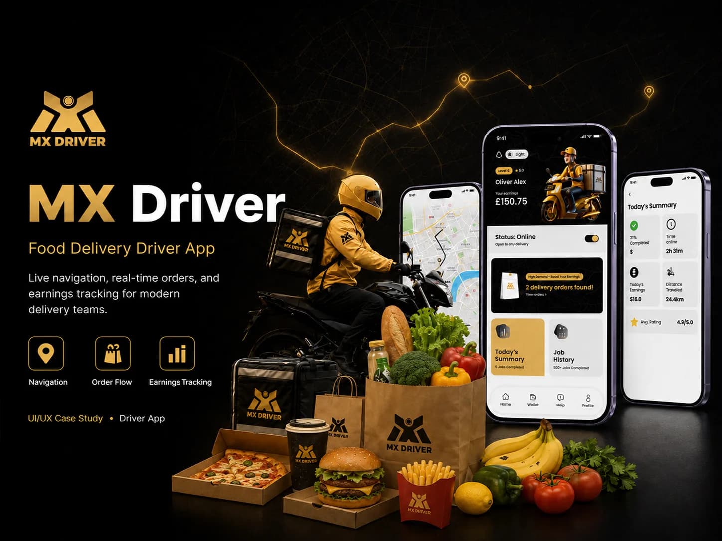
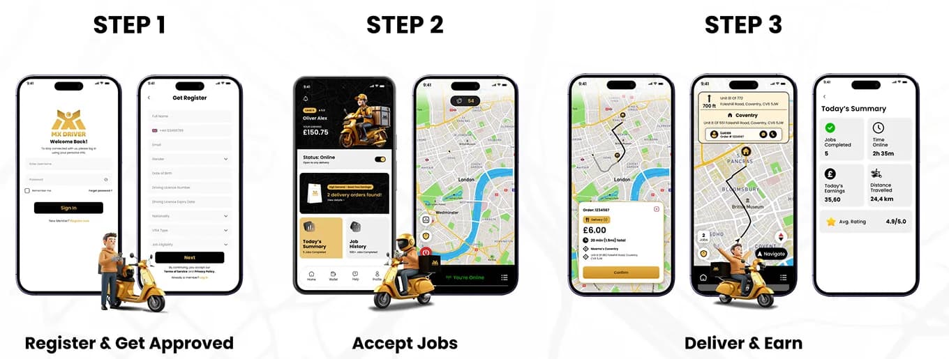
MX Driver is a mobile app for food delivery drivers. Its presentation follows a courier's working day: registering and signing in, going online, receiving and accepting orders, navigating to the restaurant, confirming pickup by scanning the order slip, delivering to the customer and reviewing a summary of the day.
What the app does
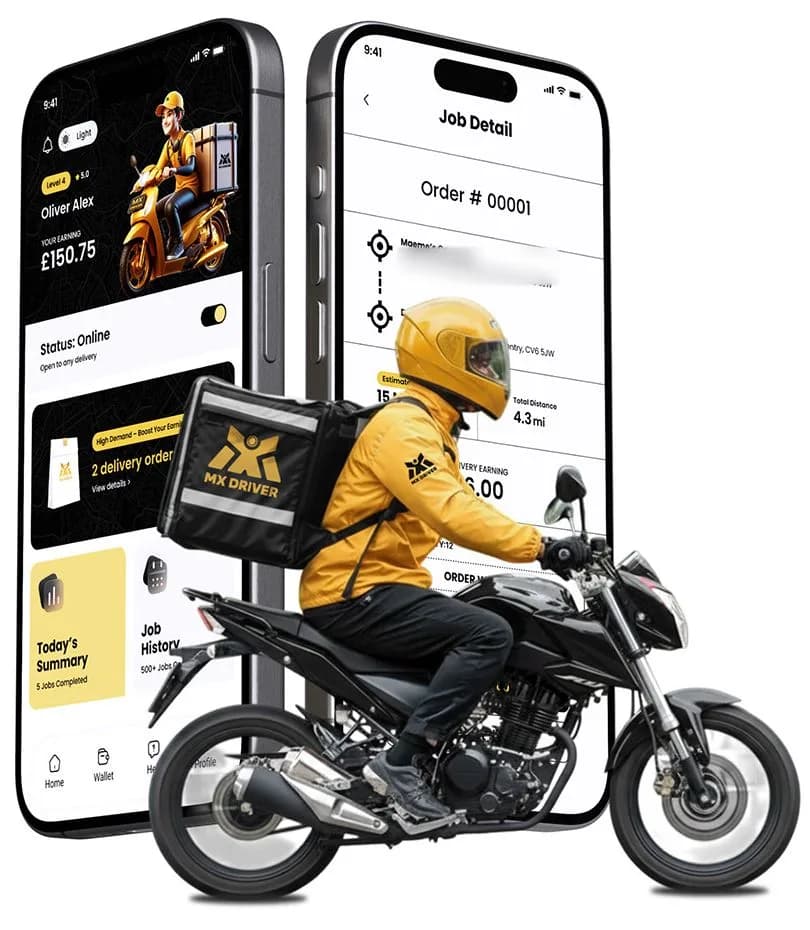
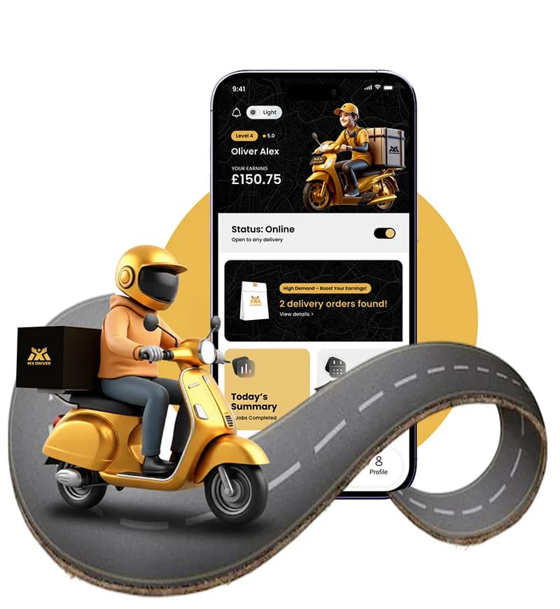
The home screen centres on a single online status switch and a prompt when delivery orders are found, with shortcuts to Today's Summary and Job History and a bottom bar for Home, Wallet, Help and Profile. Orders open as a card on the map with the amount, time and distance, and the pickup and drop-off points.
From the project presentation
Key screens and user flows

Sign-up and sign-in
A branded splash screen leads to sign-in with remember-me and forgotten-password options. Registration asks for the driver's name, phone, email, gender, date of birth, driving licence number and expiry date, nationality, visa type and job eligibility.
Accept, collect and deliver
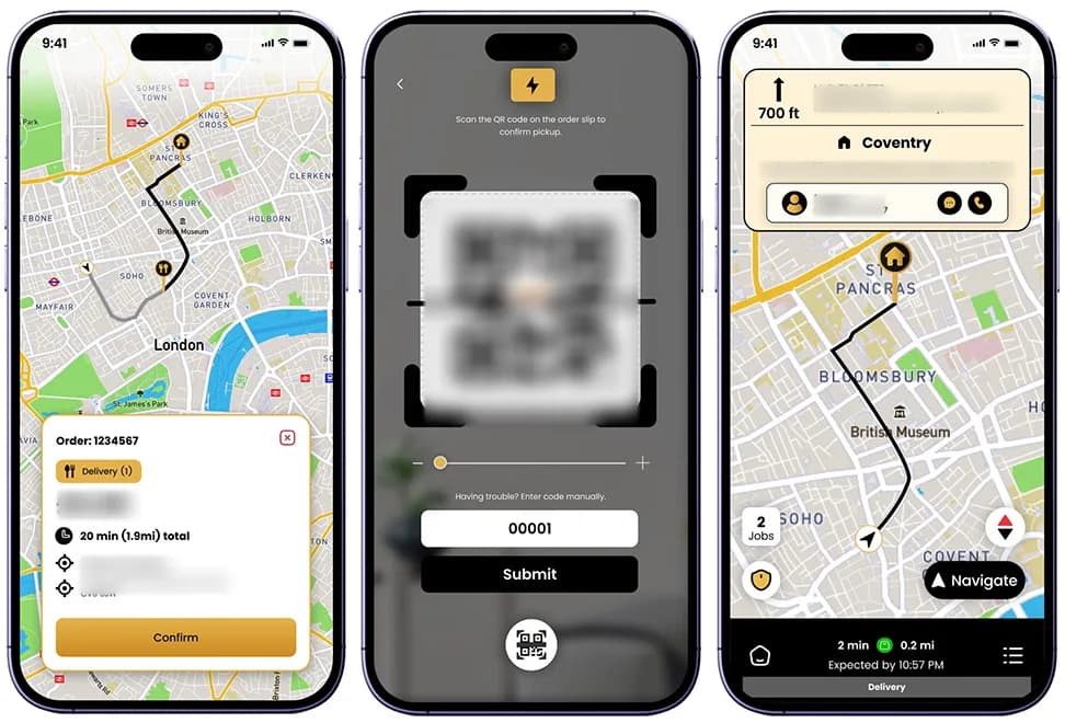
An order appears as a card on the map with the amount, time and distance and the pickup and drop-off points. Pickup is confirmed by scanning the order slip's QR code, with manual code entry as a fallback, and turn-by-turn directions guide the delivery.
Today's summary
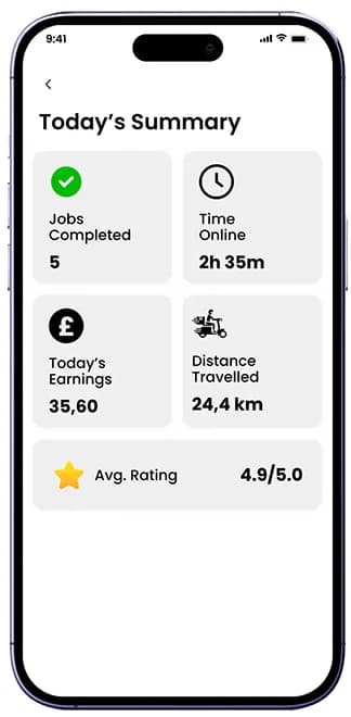
At the end of the day a summary shows jobs completed, time online, today's earnings, distance travelled and an average rating.
Visible features
- Branded splash screen
- Sign-in with remember-me and forgotten-password options
- Registration with licence, nationality, visa type and job-eligibility fields
- Online status switch on the home screen
- Prompt when delivery orders are found
- Today's Summary and Job History shortcuts
- Order card on the map with amount, time, distance and addresses
- Accept or reject an order
- Job detail with pickup and drop-off points
- QR scan of the order slip with manual code entry
- Turn-by-turn directions to the restaurant and customer
- Daily summary of jobs, time online, earnings, distance and rating
- Bottom navigation: home, wallet, help, profile
- Light mode switch
Application workflow
The presentation maps the driver's path from opening the app to a completed order. The diagram and the stages below show the same flow.

Get started
- Splash screen
- Login or registration
- Home screen
Find an order
- Order found, order summary or order history
- Open a listed order
- View the order detail
- Accept or reject
Collect
- Navigate to the restaurant
- Check in at the restaurant
- Scan the QR order slip
- Collect the order
Deliver
- Start the delivery
- Arrive at the customer's location
- Deliver the order
- Order completed
Design approach
One clear status
Going online is a single switch at the top of the home screen, and new work arrives as one prominent card, so the next action is always obvious.
Map-first order handling
Order details, directions and arrival information sit on top of the map, so a driver can accept and follow a job without leaving it.
High-contrast black and gold
Black, white and gold give strong contrast for primary actions and status, with grey and gold tint scales for surfaces and secondary states.
Short, explicit steps
The job is broken into a few named steps (accept, navigate, check in, scan the order slip, collect, deliver), each with one primary button.
Design system
Colour palette
- Black
#000000 - White
#FFFFFF - Gold
#E3B24A
The board also defines a grey scale from #D6D6D6 to #000000 and a gold scale from #FBDDB1 to #171003.
Typography
Poppins
A geometric sans-serif, shown on the board from bold display weights to the full character set. Shown here in this site's system typeface.
This case study is based on the original project presentation. Personal details, third-party names, prices, offers and QR codes are obscured in the images where they appeared; it makes no claims about results, launch status or the technology used.
More projects
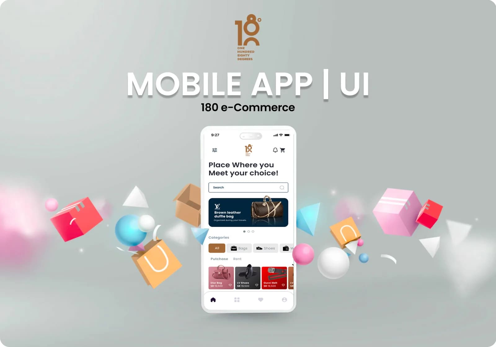 E-commerce & retail · Mobile app180 e-CommerceA mobile commerce app for branded fashion and accessories, built around four ways to trade: purchase, sell, rent and auction.Our roleUI/UX Design + DevelopmentView case study
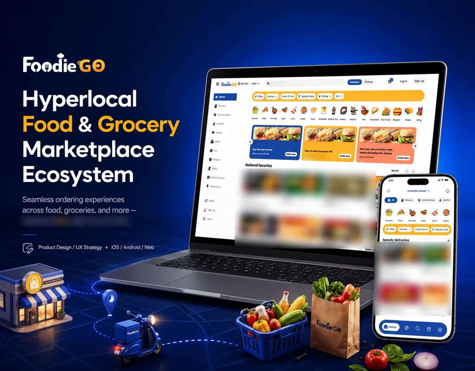 Food & Grocery · iOS, Android and webFoodieGoA hyperlocal food and grocery marketplace for iOS, Android and the web, covering category browsing, delivery or pickup ordering, order tracking and merchant tools.Our roleUI/UX Design + DevelopmentView case study
 Education · Mobile appAl BurhanA mobile app that brings class attendance, attendance history and reporting together with lecture content and illustrated guides to Makkah and Medina.Our roleUI/UX Design + DevelopmentView case study
Tell us what you want to build.
Share your goals and we will recommend where to start.