

Healthcare
iHealthCure CMS
A complaint management app where customers sign in, log issues and follow their complaints from a colour-coded dashboard.
- Industry
- Healthcare
- Platform
- Mobile app
- Our role
- UI/UX Design + Development

Project overview
iHealthCure CMS is a complaint management app. Customers sign in, raise a ticket with the details of an issue and follow it through to completion from a color-coded dashboard.
What the app does
An introduction screen leads to sign-in, with one-time-code verification and a new-password flow for forgotten passwords. The home screen totals tickets by status, a form raises a new ticket by department, category and priority, and the ticket list can be searched and filtered by date and status.
From the project presentation


Key screens and user flows

Sign-in and verification
Email and password sign-in with a fingerprint option and a forgotten-password link. Recovery continues through a one-time code with an expiry timer and a new password.

Ticket dashboard
A greeting and ticket search sit above five status tiles showing overall, pending, in-progress, canceled and completed tickets.

Raise and follow a ticket
My Tickets lists each complaint with its status and can be searched or filtered by date. A form raises a new ticket with an attached file.
Visible features
- Fingerprint sign-in option
- One-time code with expiry and resend
- Create new password
- Dashboard counts by ticket status
- Add Ticket form with department, sub-department, category and priority
- File attachment
- Ticket search and date filter
- Ticket detail view
- Profile and edit profile
- Biometric and language settings
- Help center link
Design approach
Status before detail
The home screen leads with overall, pending, in-progress, canceled and completed counts, so a customer sees where things stand first.
Color that means something
Each ticket status keeps one color on the dashboard and in the ticket list, set against white screens with an orange brand color.
A short route to raising a ticket
Add Ticket sits in the bottom navigation and gathers the department, category, priority, subject and description on one screen.
Help always in reach
Account screens keep a help center link at the bottom, and Help stays in the main navigation.
Design system
Colour palette
- Orange
#F37221 - Blue
#0F459D - Light canvas
#F0EFEF
Typography
Poppins
Used across headings, forms and status tiles, as specified on the board. Shown here in this site's system typeface.
This case study is based on the original project presentation. Personal details, third-party names, prices, offers and QR codes are obscured in the images where they appeared; it makes no claims about results, launch status or the technology used.
More projects
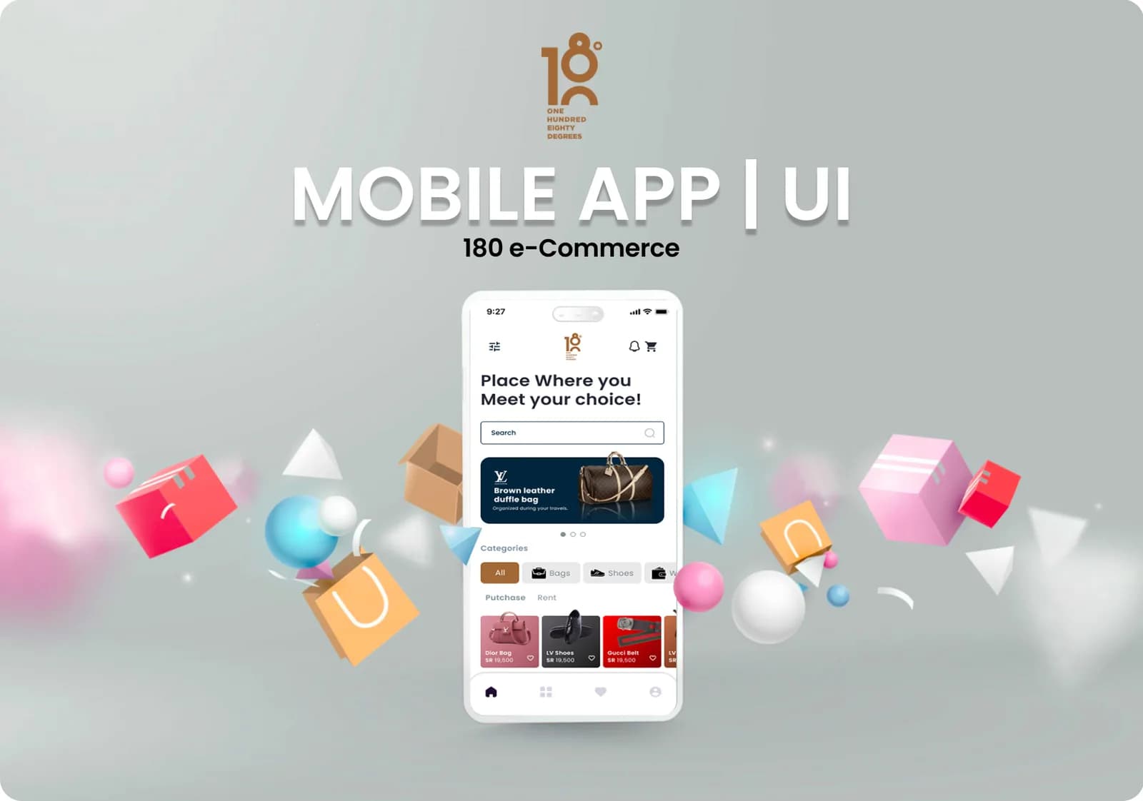 E-commerce & retail · Mobile app180 e-CommerceA mobile commerce app for branded fashion and accessories, built around four ways to trade: purchase, sell, rent and auction.Our roleUI/UX Design + DevelopmentView case study
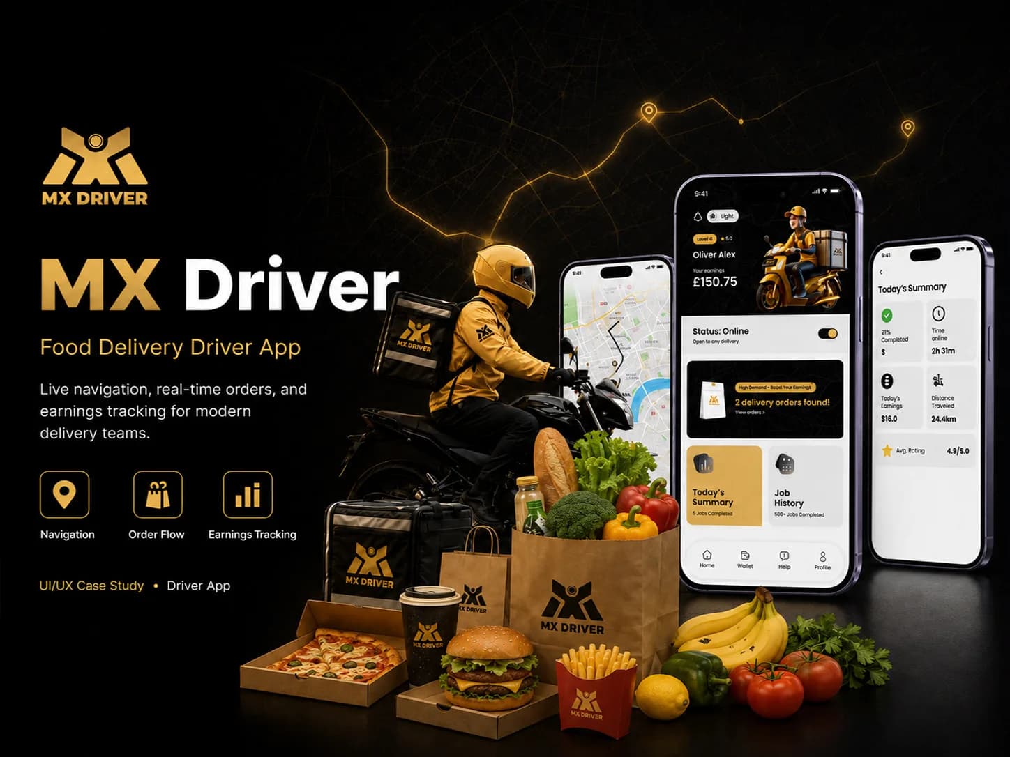 Logistics · Mobile appMX DriverA driver app for food delivery that takes couriers from sign-up to accepting orders, collecting and delivering them, and reviewing the day's work.Our roleUI/UX Design + DevelopmentView case study
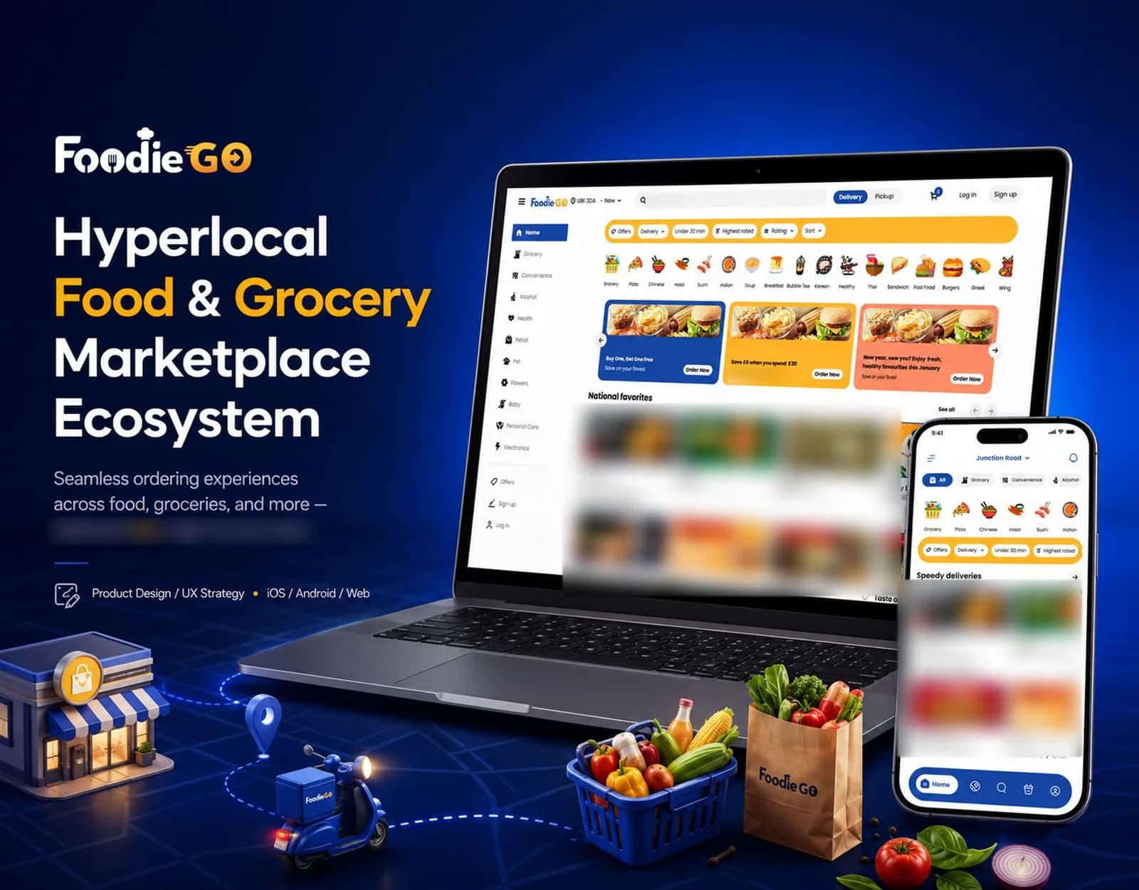 Food & Grocery · iOS, Android and webFoodieGoA hyperlocal food and grocery marketplace for iOS, Android and the web, covering category browsing, delivery or pickup ordering, order tracking and merchant tools.Our roleUI/UX Design + DevelopmentView case study
Tell us what you want to build.
Share your goals and we will recommend where to start.